The challange
"This app has very few active users."
With this pain, the client brought us in to redesign the experience and hopefully boost engagement. But me and team knew we had to dig deeper. We needed to look at the whole service, and not just the app, to understand if usability was really the problem or if something else in the process was affecting those numbers. So, I planned out the research steps.

The process
We started with qualitative research, using techniques like shadowing (observing users in real-life situation), contextual inquiries, and in-person interviews with users. We also talked to people from every internal team involved in the project.At the same time, we ran a quantitative survey that was shared on the client's social media. It asked questions about the company, the service, and the app itself.And to spot possible friction points in the app experience, I did a heuristic analysis of the full user journey.

What we found
After digging into all the research, it became clear that there were gaps all over the place, from poor internal communication between teams, to contract issues between the company and its clients. But the most significant insight was that the app didn't actually solve any real problem for users. On top of that, it wasn't even being promoted: lots of people had no idea what it was for, and some didn't even know it existed.

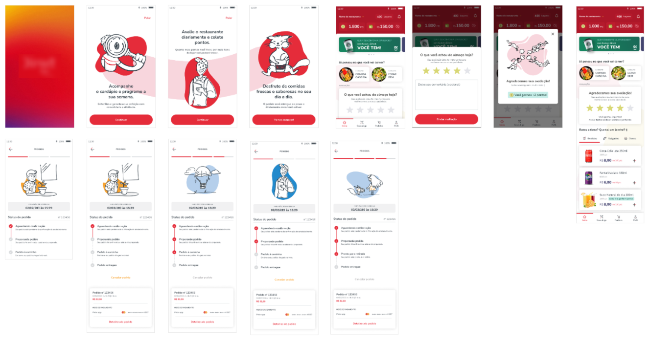
What we delivered
With all that in mind, we reimagined the entire purpose and experience of the app. That meant a new information architecture, a revamped navigation, and completely new interfaces and style guide.We also documented the process problems we had uncovered and offered practical suggestions for improvement.